Heatmap & Cluster Analysis with Map
Upload CSV data to automatically generate a heatmap, perform optimal hierarchical clustering using silhouette score, and visualize sample locations on an interactive map.

CSV Input
Results
Clustering Summary
Number of Clusters: -
Silhouette Score: -
Applications and Overview
Real-World Use Cases
- 1. Field Biology & Ecology: Classify organisms (e.g., insects, plants, fish) based on multivariate measurements, and detect geographical clusters that may reflect habitat or evolutionary divergence.
- 2. Environmental Microbiology: Cluster soil or water microbiota composition profiles to identify ecological zones or pollution impacts, and visualize them on location maps.
- 3. Metabolomics & Biomedical Research: Group clinical samples by metabolic profiles and map them to sampling sites (e.g., hospitals, regions) to uncover spatial biomarker patterns.
- 4. Epidemiology & Public Health: Automatically cluster disease-related molecular markers (e.g., cytokines, pathogen genotypes) and map the outbreak or endemic pattern for surveillance and response planning.
Analysis Overview and Instructions
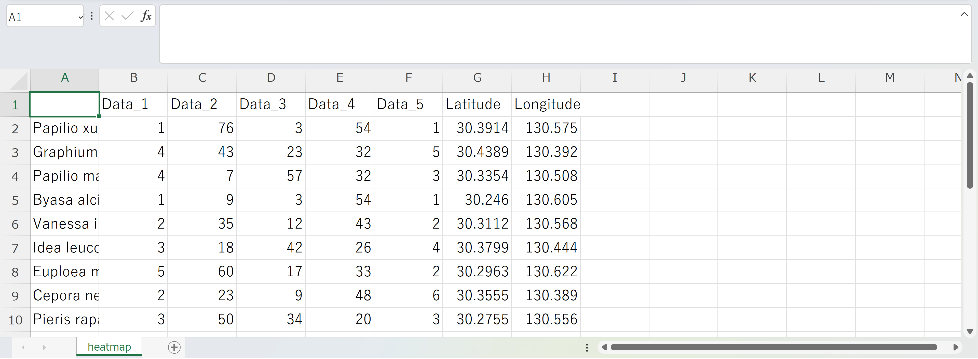
1. Input Data Format
Please upload a CSV file structured as follows:
- The first column should contain the sample names (e.g., scientific names of species).
- The last two columns must be the geographic coordinates: Latitude and Longitude.
- All intermediate columns should be numerical data (features) used for clustering.
This structure allows the tool to generate both a heatmap and a spatial distribution map.
2. What is Hierarchical Clustering Analysis (HCA)?
This tool performs Hierarchical Clustering Analysis (HCA) using the Ward linkage method, based on Euclidean distances calculated from z-score standardized feature vectors.
The resulting dendrogram determines the sample order in the heatmap and provides the structural basis for clustering.
All computations are based on the same linkage tree to ensure consistency across visualizations.
3. How Are Cluster Numbers Determined?
Instead of manually specifying the number of clusters, this tool automatically selects the optimal number using silhouette score analysis.
Multiple cluster numbers (k = 2 to 9) are tested, and the one with the highest average silhouette score is selected.
Final cluster IDs are assigned via the fcluster method by cutting the dendrogram at the corresponding optimal height.
4. Cluster-Based Color Mapping
Once cluster IDs are assigned, a consistent color palette (e.g., Set2 from Seaborn) is mapped to each cluster.
These colors are applied to both the heatmap and the geographic markers to visually distinguish clusters in all views.
This ensures that interpretation remains consistent across modalities.
5. Heatmap Visualization
The normalized data matrix is visualized using seaborn.clustermap, incorporating the precomputed hierarchical structure (row_linkage).
Each sample is color-coded along the heatmap rows according to its assigned cluster, while the dendrogram reflects the hierarchical relationships between samples.
6. Geographic Mapping of Clusters
Based on the Latitude and Longitude values, each sample is plotted on an interactive Folium map.
The cluster-based colors are reused for each map marker, and hover popups provide the sample name and cluster ID.
This enables users to observe spatial patterns in data-driven clusters across locations.
7. Example Input Format